Visual identity
The Everbridge brand visually represents resilience and the ability to empower individuals and organizations to mitigate and respond to critical events. This is symoblized through our resilience curve, which appears throughout Everbridge branding.

Logo
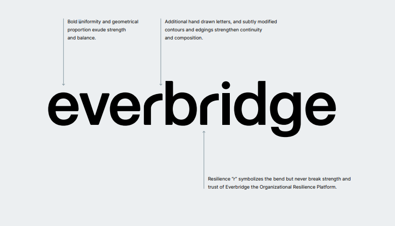
Brand recognition is built by using our logo consistently. The Everbridge brand consists of an ownable mark and logotype that visually embodies the brand story and Everbridge value proposition.
Click logo to download ⤵
Want the full logo package?
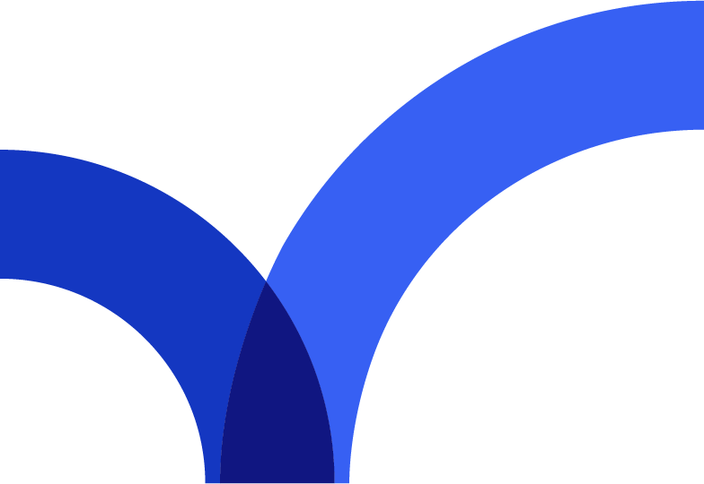
The Resilience Curve
The Resilience Curve lies in our response to critical events. It’s when all the preparation, experience, and steadfast resolve shows our true strength. Only in response to adversity is our resilience truly tested. Only then, is the trust we’ve been given by our valued customers earned.
The mark embodies everything we mean when we say bend, but never break resilience. Everbridge helps organizations protect their most valuable assets and ultimately emerge stronger from critical events with the only end-to-end resilience platform solution.

Logotype
Logo, deeper meaning and symbolism
The Resilience Curve is an ownable mark that embodies the brand story and value proposition of Everbridge. It is an elegant and simple representation of the resilience we provide to our customers. The arc symbolizes a rapid response to critical events, and most importantly the upward strength, safety and recovery in The Resilience Curve.
Typography, with bold, hand-drawn, sans serif type delivers cohesiveness to messaging, ease of legibility and clearly announces who we are.
Horizontal logo
The horizontal version of the Everbridge logo is the primary brand mark and should be used across most collateral — ranging from digital layouts to print pieces.
Stacked logo
The Everbridge stacked logo should be used sparingly and only appear when the horizontal logo isn’t sufficient.
Note: The stacked version of the Everbridge logo should only be used if the horizontal version would be too small or not fit the space well. Examples of when to use it would be vertical ads,
vertical banners, event booths, and swag (like a branded shirt, sticker, or pin).
Everbridge mark
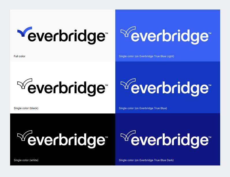
The Everbridge mark can be used as a substitute when the brand identity has already been established. When possible, keep the logomark in full color. However, it can be used in black and white when necessary.
Full color and single color usage
The Everbridge logo can be used in the horizontal formats below. When possible, keep the logo in full color. However, it can be used in black and white when necessary.
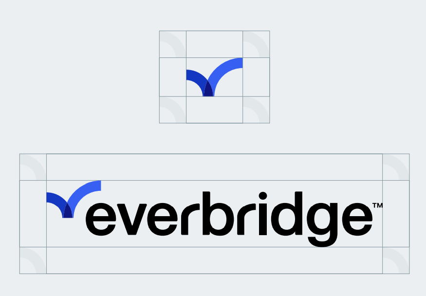
Negative space
Negative space protects the logo’s legibility by separating it from other competing visual elements. The negative space should be equal to the descending arc in the Everbridge logomark.
Minimum sizes
To ensure legibility, it’s important to not make the Everbridge logo or mark smaller than the recommended sizes:
Full color logo specs:
The Resilience Curve:
- Digital: 16px width
- Print: 0.5″ width
Full Logo:
- Digital: 100px width
- Print: 1.25″ width
Stacked Logo:
- Digital: 80px width
- Print: 1.1″ width
Single color logo specs:
The Resilience Curve:
- Digital: 20px width, 1.5 line weight
- Print: 0.5″ width, 2pt line weight
Full Logo:
- Digital: 100px width
- Print: 1.25″ width
Stacked Logo:
- Digital: 80px width
- Print: 1.1″ width
Logo misuse examples
the following are examples of how the Everbridge logo and mark should NOT be used.
Sub-brand logos
The brand visual story is extended throughout the Everbridge sub-brand logos.
Everbridge 360
Manage critical events, ensure safety
Click logo to download ⤵
BC in the Cloud
Streamline planning activities and identify impact
Click logo to download ⤵

xMatters
Optimize operations through automation and AI
Click logo to download ⤵
RedSky
Protect your workforce with E911
Click logo to download ⤵
SnapComms
Reach and engage employees
Click logo to download ⤵
Travel Risk Management
Safeguard traveling and remote employees
Click logo to download ⤵
Everbridge Assist
A one-call comprehensive medical, security and travel assistance service.
Click logo to download ⤵
Scaling
Legibility is important when maintaining our brand identity. The Everbridge logotype should always be legible and should therefore never be less than 60px wide.
Color
The Everbridge brand carries with it a depth of trust, wisdom, reliability, stability, and intelligence, as well as courage and dedication. There is no color that embodies these traits more so than…
Primary colors
The primary colors in the Everbridge palette are the three shades of Everbridge True Blue. Everbridge True Blue should be paired with ample amounts of white and grey and minimal amounts of black.
Everbridge True Blue 1
HEX:
RGB:
CMYK:
Everbridge True Blue 2
HEX:
RGB:
CMYK:
Everbridge True Blue 3
HEX:
RGB:
CMYK:
Secondary colors
Colors within the secondary palette are used to represent sub-brands and may be used minimally throughout web and print layouts.
Secondary Color 1
HEX:
RGB:
CMYK:
Secondary Color 2
HEX:
RGB:
CMYK:
Secondary Color 3
HEX:
RGB:
CMYK:
Secondary Color 4
HEX:
RGB:
CMYK:
Secondary Color 5
HEX:
RGB:
CMYK:
Secondary Color 6
HEX:
RGB:
CMYK:
Neutral colors
Colors within the neutral palette can be used as floods of color, hover states, and within illustrations. They can serve as a dividing element between sections to provide extra clarity and distinction.
Bright White
HEX:
RGB:
CMYK:
Black
HEX:
RGB:
CMYK:
Neutral 1
HEX:
RGB:
CMYK:
Neutral Color 2
HEX:
RGB:
CMYK:
Neutral Color 3
HEX:
RGB:
CMYK:
Neutral Color 4
HEX:
RGB:
CMYK:
Neutral 5
HEX:
RGB:
CMYK:
Neutral 6
HEX:
RGB:
CMYK:
Neutral 7
HEX:
RGB:
CMYK:
Neutral 8
HEX:
RGB:
CMYK:
Neutral 9
HEX:
RGB:
CMYK:
Color distribution
Colors from the neutral palette can be used equally. White is the leading background color on all web and most print layouts. Colors from the neutral palette can be used to help establish a new section. Black is used for all type and iconography, but should not be a dominant color in any layout or design.
Typography
We carefully selected a typeface that is technical but friendly to round out the Everbridge brand. Our typeface for all headlines, body copy, and CTAs is Inter.
You can download Inter here.